
.fe-67d02740a4b9ef6f8291977a {
–grid-gutter: calc(var(–sqs-mobile-site-gutter, 6vw) – 11.0px);
–cell-max-width: calc( ( var(–sqs-site-max-width, 1500px) – (11.0px * (8 – 1)) ) / 8 );
display: grid;
position: relative;
grid-area: 1/1/-1/-1;
grid-template-rows: repeat(1,minmax(24px, auto));
grid-template-columns:
minmax(var(–grid-gutter), 1fr)
repeat(8, minmax(0, var(–cell-max-width)))
minmax(var(–grid-gutter), 1fr);
row-gap: 11.0px;
column-gap: 11.0px;
overflow-x: hidden;
overflow-x: clip;
}
@media (min-width: 768px) {
.background-width–inset .fe-67d02740a4b9ef6f8291977a {
–inset-padding: calc(var(–sqs-site-gutter) * 2);
}
.fe-67d02740a4b9ef6f8291977a {
–grid-gutter: calc(var(–sqs-site-gutter, 4vw) – 11.0px);
–cell-max-width: calc( ( var(–sqs-site-max-width, 1500px) – (11.0px * (24 – 1)) ) / 24 );
–inset-padding: 0vw;
–row-height-scaling-factor: 0.0215;
–container-width: min(var(–sqs-site-max-width, 1500px), calc(100vw – var(–sqs-site-gutter, 4vw) * 2 – var(–inset-padding) ));
grid-template-rows: repeat(1,minmax(calc(var(–container-width) * var(–row-height-scaling-factor)), auto));
grid-template-columns:
minmax(var(–grid-gutter), 1fr)
repeat(24, minmax(0, var(–cell-max-width)))
minmax(var(–grid-gutter), 1fr);
}
}
.fe-69d25b641a2f451afd95a148 {
–grid-gutter: calc(var(–sqs-mobile-site-gutter, 6vw) – 11.0px);
–cell-max-width: calc( ( var(–sqs-site-max-width, 1500px) – (11.0px * (8 – 1)) ) / 8 );
display: grid;
position: relative;
grid-area: 1/1/-1/-1;
grid-template-rows: repeat(22,minmax(24px, auto));
grid-template-columns:
minmax(var(–grid-gutter), 1fr)
repeat(8, minmax(0, var(–cell-max-width)))
minmax(var(–grid-gutter), 1fr);
row-gap: 11.0px;
column-gap: 11.0px;
overflow-x: hidden;
overflow-x: clip;
}
@media (min-width: 768px) {
.background-width–inset .fe-69d25b641a2f451afd95a148 {
–inset-padding: calc(var(–sqs-site-gutter) * 2);
}
.fe-69d25b641a2f451afd95a148 {
–grid-gutter: calc(var(–sqs-site-gutter, 4vw) – 11.0px);
–cell-max-width: calc( ( var(–sqs-site-max-width, 1500px) – (11.0px * (24 – 1)) ) / 24 );
–inset-padding: 0vw;
–row-height-scaling-factor: 0.0215;
–container-width: min(var(–sqs-site-max-width, 1500px), calc(100vw – var(–sqs-site-gutter, 4vw) * 2 – var(–inset-padding) ));
grid-template-rows: repeat(28,minmax(calc(var(–container-width) * var(–row-height-scaling-factor)), auto));
grid-template-columns:
minmax(var(–grid-gutter), 1fr)
repeat(24, minmax(0, var(–cell-max-width)))
minmax(var(–grid-gutter), 1fr);
}
}
.fe-block-f3a7eb89d375c1df0595 {
grid-area: 1/2/11/10;
z-index: 0;
@media (max-width: 767px) {
}
}
.fe-block-f3a7eb89d375c1df0595 .sqs-block {
justify-content: flex-start;
}
.fe-block-f3a7eb89d375c1df0595 .sqs-block-alignment-wrapper {
align-items: flex-start;
}
@media (min-width: 768px) {
.fe-block-f3a7eb89d375c1df0595 {
grid-area: 1/2/12/26;
z-index: 0;
}
.fe-block-f3a7eb89d375c1df0595 .sqs-block {
justify-content: flex-start;
}
.fe-block-f3a7eb89d375c1df0595 .sqs-block-alignment-wrapper {
align-items: flex-start;
}
}
.fe-block-7ee9ef008fefec04277d {
grid-area: 11/2/12/10;
z-index: 1;
@media (max-width: 767px) {
}
}
.fe-block-7ee9ef008fefec04277d .sqs-block {
justify-content: center;
}
.fe-block-7ee9ef008fefec04277d .sqs-block-alignment-wrapper {
align-items: center;
}
@media (min-width: 768px) {
.fe-block-7ee9ef008fefec04277d {
grid-area: 12/2/13/26;
z-index: 1;
}
.fe-block-7ee9ef008fefec04277d .sqs-block {
justify-content: center;
}
.fe-block-7ee9ef008fefec04277d .sqs-block-alignment-wrapper {
align-items: center;
}
}
.fe-block-yui_3_17_2_1_1775393282447_99810 {
grid-area: 12/2/14/10;
z-index: 29;
@media (max-width: 767px) {
}
}
.fe-block-yui_3_17_2_1_1775393282447_99810 .sqs-block {
justify-content: flex-start;
}
.fe-block-yui_3_17_2_1_1775393282447_99810 .sqs-block-alignment-wrapper {
align-items: flex-start;
}
@media (min-width: 768px) {
.fe-block-yui_3_17_2_1_1775393282447_99810 {
grid-area: 13/2/29/14;
z-index: 29;
}
.fe-block-yui_3_17_2_1_1775393282447_99810 .sqs-block {
justify-content: flex-start;
}
.fe-block-yui_3_17_2_1_1775393282447_99810 .sqs-block-alignment-wrapper {
align-items: flex-start;
}
}
.fe-block-3f718d2d2aaee3fc2f87 {
grid-area: 14/2/20/10;
z-index: 15;
@media (max-width: 767px) {
}
}
.fe-block-3f718d2d2aaee3fc2f87 .sqs-block {
justify-content: center;
}
.fe-block-3f718d2d2aaee3fc2f87 .sqs-block-alignment-wrapper {
align-items: center;
}
@media (min-width: 768px) {
.fe-block-3f718d2d2aaee3fc2f87 {
grid-area: 13/14/28/26;
z-index: 15;
}
.fe-block-3f718d2d2aaee3fc2f87 .sqs-block {
justify-content: center;
}
.fe-block-3f718d2d2aaee3fc2f87 .sqs-block-alignment-wrapper {
align-items: center;
}
}
Web Design
Your website isn’t just a digital brochure; it’s your first impression, your brand’s handshake, and your best sales tool. A good website should feel like an extension of the company, not a placeholder for one.
That is where Windwood fits. We do not approach web design as a standalone technical service. We approach it as an integrated storytelling and business-clarity project. The structure matters. The words matter. The visuals matter. The first impression matters. When all of those things are aligned, the website stops feeling like something you checked off a box to get and starts becoming one of the clearest ways the company presents itself to the outside world.
Windwood designs websites for companies that want something more specific than a generic build. That may mean a full custom site for a larger company, a content-first rebuild for a business that has outgrown its current site, or a website system built around original media and clearer messaging. We help organizations create websites that reflect the quality of the business and people behind them.
What we’re solving for our clients:
The companies that come to us for web design are usually dealing with one or more of these problems:
-
the current site does not reflect the quality of the company
-
the visuals are weak, generic, or outdated
-
the messaging is unclear or too broad
-
the site does not do a good job helping someone understand the business quickly
-
the company has grown, but the website still feels like an earlier version of the brand
-
the team wants a website built around real content instead of stock placeholders
-
the website needs to become a stronger sales, recruiting, and trust-building tool
.fe-69d25c13fff8fd69ac6697ca {
–grid-gutter: calc(var(–sqs-mobile-site-gutter, 6vw) – 11.0px);
–cell-max-width: calc( ( var(–sqs-site-max-width, 1500px) – (11.0px * (8 – 1)) ) / 8 );
display: grid;
position: relative;
grid-area: 1/1/-1/-1;
grid-template-rows: repeat(2,minmax(24px, auto));
grid-template-columns:
minmax(var(–grid-gutter), 1fr)
repeat(8, minmax(0, var(–cell-max-width)))
minmax(var(–grid-gutter), 1fr);
row-gap: 11.0px;
column-gap: 11.0px;
overflow-x: hidden;
overflow-x: clip;
}
@media (min-width: 768px) {
.background-width–inset .fe-69d25c13fff8fd69ac6697ca {
–inset-padding: calc(var(–sqs-site-gutter) * 2);
}
.fe-69d25c13fff8fd69ac6697ca {
–grid-gutter: calc(var(–sqs-site-gutter, 4vw) – 11.0px);
–cell-max-width: calc( ( var(–sqs-site-max-width, 1500px) – (11.0px * (24 – 1)) ) / 24 );
–inset-padding: 0vw;
–row-height-scaling-factor: 0.0215;
–container-width: min(var(–sqs-site-max-width, 1500px), calc(100vw – var(–sqs-site-gutter, 4vw) * 2 – var(–inset-padding) ));
grid-template-rows: repeat(11,minmax(calc(var(–container-width) * var(–row-height-scaling-factor)), auto));
grid-template-columns:
minmax(var(–grid-gutter), 1fr)
repeat(24, minmax(0, var(–cell-max-width)))
minmax(var(–grid-gutter), 1fr);
}
}
.fe-block-yui_3_17_2_1_1775393282447_191103 {
grid-area: 1/2/3/10;
z-index: 1;
@media (max-width: 767px) {
}
}
.fe-block-yui_3_17_2_1_1775393282447_191103 .sqs-block {
justify-content: flex-start;
}
.fe-block-yui_3_17_2_1_1775393282447_191103 .sqs-block-alignment-wrapper {
align-items: flex-start;
}
@media (min-width: 768px) {
.fe-block-yui_3_17_2_1_1775393282447_191103 {
grid-area: 1/2/12/26;
z-index: 1;
}
.fe-block-yui_3_17_2_1_1775393282447_191103 .sqs-block {
justify-content: flex-start;
}
.fe-block-yui_3_17_2_1_1775393282447_191103 .sqs-block-alignment-wrapper {
align-items: flex-start;
}
}
What makes Windwood web different:
Windwood’s web work is strongest when the website is built around original content and a clearer story.
A lot of website vendors start with a template and wait for the client to fill in the blanks. That usually leads to weak copy, generic imagery, and a site that feels interchangeable with five others in the same category.
We work differently. Our strongest website projects begin by figuring out what the company actually needs to say, what the audience actually needs to understand, and what kind of visual system will support that. Sometimes that includes interviews, original photography, video, brand assets, project stories, hiring media, or leadership messaging. Sometimes it means helping pull the substance out of a business that knows what it does well but has never had to explain it clearly online.
That content-first approach is why this service belongs at Windwood. It is not just web development. It is a stronger way of presenting the company.
.fe-69d25cd8bbb3132bcc182254 {
–grid-gutter: calc(var(–sqs-mobile-site-gutter, 6vw) – 11.0px);
–cell-max-width: calc( ( var(–sqs-site-max-width, 1500px) – (11.0px * (8 – 1)) ) / 8 );
display: grid;
position: relative;
grid-area: 1/1/-1/-1;
grid-template-rows: repeat(12,minmax(24px, auto));
grid-template-columns:
minmax(var(–grid-gutter), 1fr)
repeat(8, minmax(0, var(–cell-max-width)))
minmax(var(–grid-gutter), 1fr);
row-gap: 11.0px;
column-gap: 11.0px;
overflow-x: hidden;
overflow-x: clip;
}
@media (min-width: 768px) {
.background-width–inset .fe-69d25cd8bbb3132bcc182254 {
–inset-padding: calc(var(–sqs-site-gutter) * 2);
}
.fe-69d25cd8bbb3132bcc182254 {
–grid-gutter: calc(var(–sqs-site-gutter, 4vw) – 11.0px);
–cell-max-width: calc( ( var(–sqs-site-max-width, 1500px) – (11.0px * (24 – 1)) ) / 24 );
–inset-padding: 0vw;
–row-height-scaling-factor: 0.0215;
–container-width: min(var(–sqs-site-max-width, 1500px), calc(100vw – var(–sqs-site-gutter, 4vw) * 2 – var(–inset-padding) ));
grid-template-rows: repeat(16,minmax(calc(var(–container-width) * var(–row-height-scaling-factor)), auto));
grid-template-columns:
minmax(var(–grid-gutter), 1fr)
repeat(24, minmax(0, var(–cell-max-width)))
minmax(var(–grid-gutter), 1fr);
}
}
.fe-block-yui_3_17_2_1_1775393282447_198171 {
grid-area: 1/2/3/10;
z-index: 1;
@media (max-width: 767px) {
}
}
.fe-block-yui_3_17_2_1_1775393282447_198171 .sqs-block {
justify-content: flex-start;
}
.fe-block-yui_3_17_2_1_1775393282447_198171 .sqs-block-alignment-wrapper {
align-items: flex-start;
}
@media (min-width: 768px) {
.fe-block-yui_3_17_2_1_1775393282447_198171 {
grid-area: 1/2/16/13;
z-index: 1;
}
.fe-block-yui_3_17_2_1_1775393282447_198171 .sqs-block {
justify-content: flex-start;
}
.fe-block-yui_3_17_2_1_1775393282447_198171 .sqs-block-alignment-wrapper {
align-items: flex-start;
}
}
.fe-block-yui_3_17_2_1_1775312019130_2237050 {
grid-area: 3/2/11/10;
z-index: 2;
@media (max-width: 767px) {
}
}
.fe-block-yui_3_17_2_1_1775312019130_2237050 .sqs-block {
justify-content: flex-start;
}
.fe-block-yui_3_17_2_1_1775312019130_2237050 .sqs-block-alignment-wrapper {
align-items: flex-start;
}
@media (min-width: 768px) {
.fe-block-yui_3_17_2_1_1775312019130_2237050 {
grid-area: 1/14/10/26;
z-index: 2;
}
.fe-block-yui_3_17_2_1_1775312019130_2237050 .sqs-block {
justify-content: flex-start;
}
.fe-block-yui_3_17_2_1_1775312019130_2237050 .sqs-block-alignment-wrapper {
align-items: flex-start;
}
}
.fe-block-yui_3_17_2_1_1775393282447_199532 {
grid-area: 11/2/13/10;
z-index: 3;
@media (max-width: 767px) {
}
}
.fe-block-yui_3_17_2_1_1775393282447_199532 .sqs-block {
justify-content: center;
}
.fe-block-yui_3_17_2_1_1775393282447_199532 .sqs-block-alignment-wrapper {
align-items: center;
}
@media (min-width: 768px) {
.fe-block-yui_3_17_2_1_1775393282447_199532 {
grid-area: 11/14/16/26;
z-index: 3;
}
.fe-block-yui_3_17_2_1_1775393282447_199532 .sqs-block {
justify-content: center;
}
.fe-block-yui_3_17_2_1_1775393282447_199532 .sqs-block-alignment-wrapper {
align-items: center;
}
}
A good fit for web with Windwood:
This service is usually the right fit when:
-
the business cares how it is perceived online
-
the current site no longer matches the quality of the company
-
the team wants a website built around real media and real messaging
-
the company has enough complexity that a simple brochure site is no longer enough
-
the website needs to support trust, lead generation, hiring, or long-term brand visibility
.fe-69d25e493f58bb231ce75fe6 {
–grid-gutter: calc(var(–sqs-mobile-site-gutter, 6vw) – 11.0px);
–cell-max-width: calc( ( var(–sqs-site-max-width, 1500px) – (11.0px * (8 – 1)) ) / 8 );
display: grid;
position: relative;
grid-area: 1/1/-1/-1;
grid-template-rows: repeat(22,minmax(24px, auto));
grid-template-columns:
minmax(var(–grid-gutter), 1fr)
repeat(8, minmax(0, var(–cell-max-width)))
minmax(var(–grid-gutter), 1fr);
row-gap: 11.0px;
column-gap: 11.0px;
overflow-x: hidden;
overflow-x: clip;
}
@media (min-width: 768px) {
.background-width–inset .fe-69d25e493f58bb231ce75fe6 {
–inset-padding: calc(var(–sqs-site-gutter) * 2);
}
.fe-69d25e493f58bb231ce75fe6 {
–grid-gutter: calc(var(–sqs-site-gutter, 4vw) – 11.0px);
–cell-max-width: calc( ( var(–sqs-site-max-width, 1500px) – (11.0px * (24 – 1)) ) / 24 );
–inset-padding: 0vw;
–row-height-scaling-factor: 0.0215;
–container-width: min(var(–sqs-site-max-width, 1500px), calc(100vw – var(–sqs-site-gutter, 4vw) * 2 – var(–inset-padding) ));
grid-template-rows: repeat(27,minmax(calc(var(–container-width) * var(–row-height-scaling-factor)), auto));
grid-template-columns:
minmax(var(–grid-gutter), 1fr)
repeat(24, minmax(0, var(–cell-max-width)))
minmax(var(–grid-gutter), 1fr);
}
}
.fe-block-440082b6db96f73dcced {
grid-area: 2/2/13/10;
z-index: 4;
@media (max-width: 767px) {
}
}
.fe-block-440082b6db96f73dcced .sqs-block {
justify-content: center;
}
.fe-block-440082b6db96f73dcced .sqs-block-alignment-wrapper {
align-items: center;
}
@media (min-width: 768px) {
.fe-block-440082b6db96f73dcced {
grid-area: 1/14/28/27;
z-index: 4;
}
.fe-block-440082b6db96f73dcced .sqs-block {
justify-content: center;
}
.fe-block-440082b6db96f73dcced .sqs-block-alignment-wrapper {
align-items: center;
}
}
.fe-block-6a8a965e2bc9eaed6acf {
grid-area: 13/2/15/10;
z-index: 5;
@media (max-width: 767px) {
}
}
.fe-block-6a8a965e2bc9eaed6acf .sqs-block {
justify-content: flex-start;
}
.fe-block-6a8a965e2bc9eaed6acf .sqs-block-alignment-wrapper {
align-items: flex-start;
}
@media (min-width: 768px) {
.fe-block-6a8a965e2bc9eaed6acf {
grid-area: 1/2/15/14;
z-index: 5;
}
.fe-block-6a8a965e2bc9eaed6acf .sqs-block {
justify-content: flex-start;
}
.fe-block-6a8a965e2bc9eaed6acf .sqs-block-alignment-wrapper {
align-items: flex-start;
}
}
.fe-block-yui_3_17_2_1_1775393282447_203317 {
grid-area: 15/2/21/10;
z-index: 6;
@media (max-width: 767px) {
}
}
.fe-block-yui_3_17_2_1_1775393282447_203317 .sqs-block {
justify-content: center;
}
.fe-block-yui_3_17_2_1_1775393282447_203317 .sqs-block-alignment-wrapper {
align-items: center;
}
@media (min-width: 768px) {
.fe-block-yui_3_17_2_1_1775393282447_203317 {
grid-area: 15/2/24/14;
z-index: 6;
}
.fe-block-yui_3_17_2_1_1775393282447_203317 .sqs-block {
justify-content: center;
}
.fe-block-yui_3_17_2_1_1775393282447_203317 .sqs-block-alignment-wrapper {
align-items: center;
}
}
.fe-block-yui_3_17_2_1_1775393282447_204679 {
grid-area: 21/2/23/10;
z-index: 7;
@media (max-width: 767px) {
}
}
.fe-block-yui_3_17_2_1_1775393282447_204679 .sqs-block {
justify-content: center;
}
.fe-block-yui_3_17_2_1_1775393282447_204679 .sqs-block-alignment-wrapper {
align-items: center;
}
@media (min-width: 768px) {
.fe-block-yui_3_17_2_1_1775393282447_204679 {
grid-area: 24/2/28/14;
z-index: 7;
}
.fe-block-yui_3_17_2_1_1775393282447_204679 .sqs-block {
justify-content: center;
}
.fe-block-yui_3_17_2_1_1775393282447_204679 .sqs-block-alignment-wrapper {
align-items: center;
}
}
W. L. French Excavating
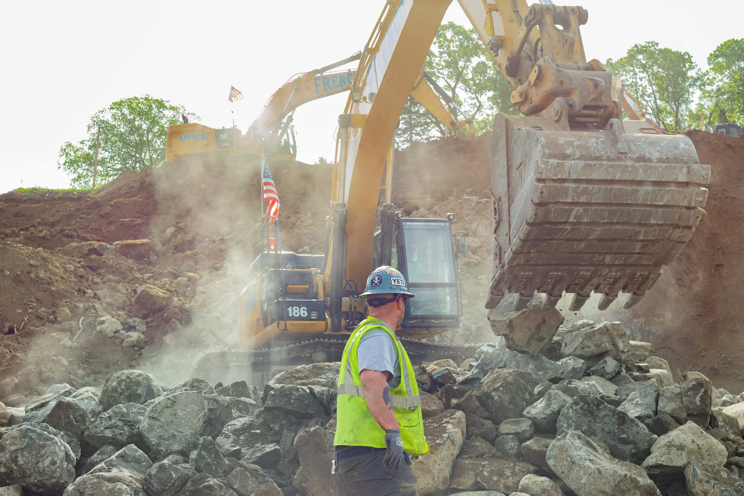
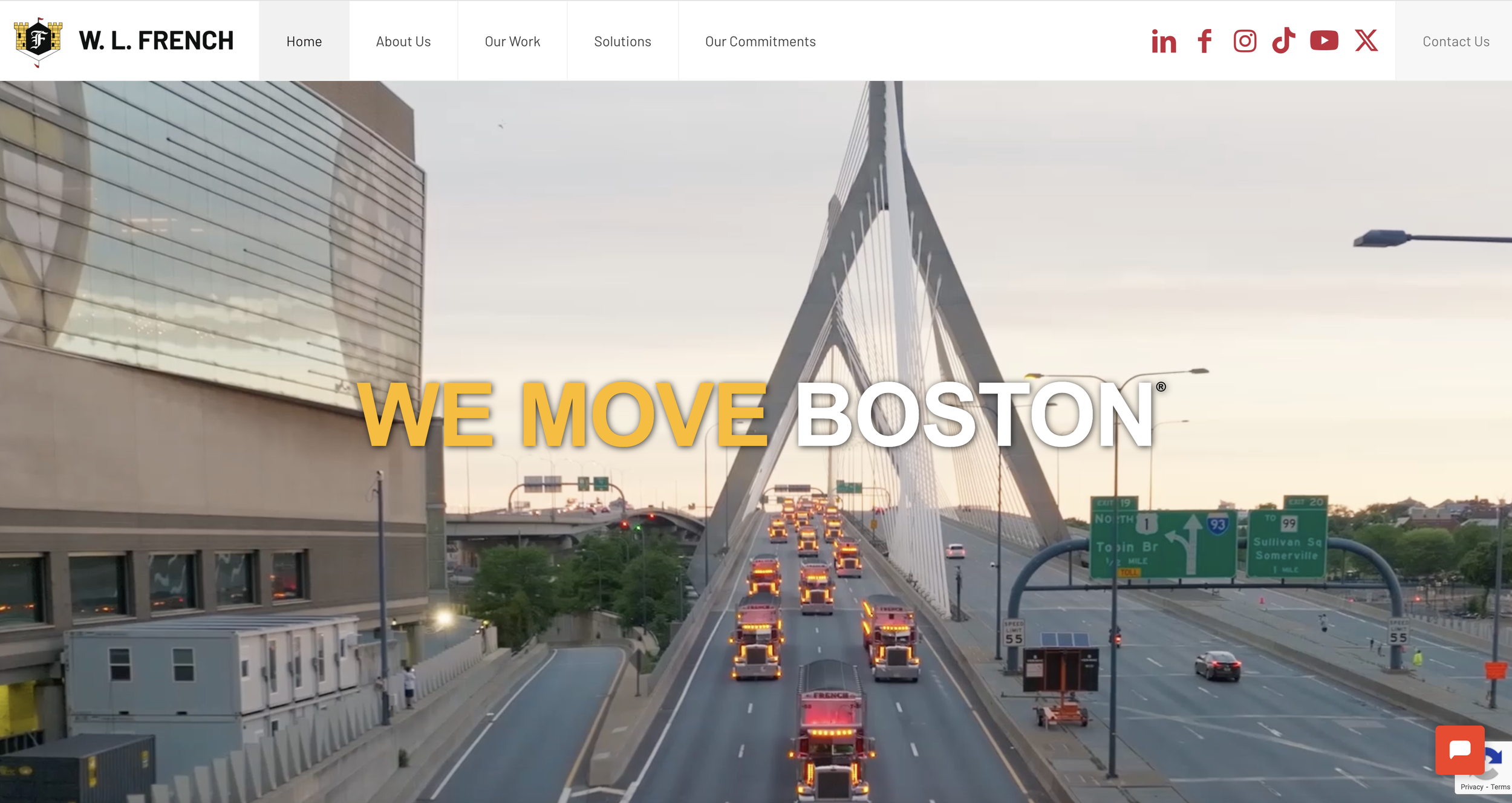
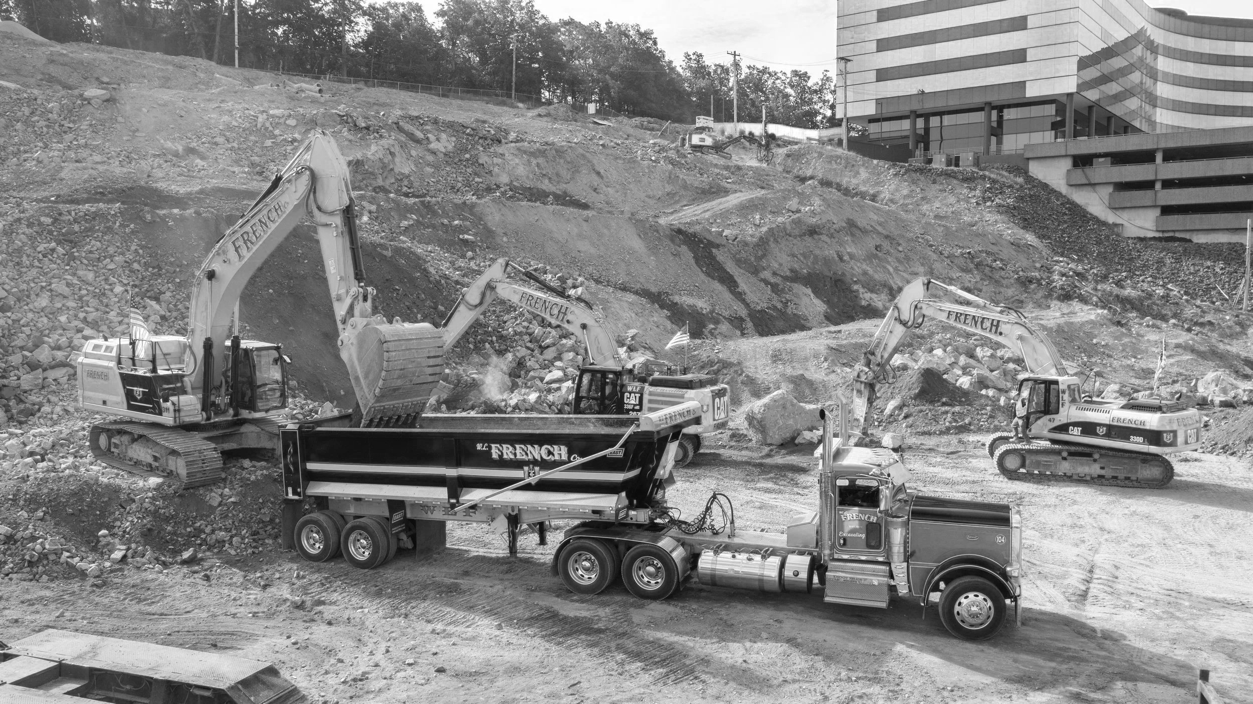
W. L. French is one of the most recognizable and respected sitework contractors in Greater Boston, with a long-standing reputation for excellence. We have worked to build their brand over the past decade with content creation, social media management, and web initiatives. With over fifty years in business and national recognition through ENR’s Top 600 Specialty Contractors list, where it ranked among the top excavating and foundation firms in the country. That is what made the website work important. This was not a simple contractor refresh. It was a build for a highly visible, multi-service company whose digital presence needed to reflect the scale, credibility, and regional stature W. L. French has earned over five decades.
.fe-69d260b0bd791b45caa3c529 {
–grid-gutter: calc(var(–sqs-mobile-site-gutter, 6vw) – 11.0px);
–cell-max-width: calc( ( var(–sqs-site-max-width, 1500px) – (11.0px * (8 – 1)) ) / 8 );
display: grid;
position: relative;
grid-area: 1/1/-1/-1;
grid-template-rows: repeat(22,minmax(24px, auto));
grid-template-columns:
minmax(var(–grid-gutter), 1fr)
repeat(8, minmax(0, var(–cell-max-width)))
minmax(var(–grid-gutter), 1fr);
row-gap: 11.0px;
column-gap: 11.0px;
overflow-x: hidden;
overflow-x: clip;
}
@media (min-width: 768px) {
.background-width–inset .fe-69d260b0bd791b45caa3c529 {
–inset-padding: calc(var(–sqs-site-gutter) * 2);
}
.fe-69d260b0bd791b45caa3c529 {
–grid-gutter: calc(var(–sqs-site-gutter, 4vw) – 11.0px);
–cell-max-width: calc( ( var(–sqs-site-max-width, 1500px) – (11.0px * (24 – 1)) ) / 24 );
–inset-padding: 0vw;
–row-height-scaling-factor: 0.0215;
–container-width: min(var(–sqs-site-max-width, 1500px), calc(100vw – var(–sqs-site-gutter, 4vw) * 2 – var(–inset-padding) ));
grid-template-rows: repeat(25,minmax(calc(var(–container-width) * var(–row-height-scaling-factor)), auto));
grid-template-columns:
minmax(var(–grid-gutter), 1fr)
repeat(24, minmax(0, var(–cell-max-width)))
minmax(var(–grid-gutter), 1fr);
}
}
.fe-block-82f92d939c57584a0fa6 {
grid-area: 2/2/13/10;
z-index: 4;
@media (max-width: 767px) {
}
}
.fe-block-82f92d939c57584a0fa6 .sqs-block {
justify-content: center;
}
.fe-block-82f92d939c57584a0fa6 .sqs-block-alignment-wrapper {
align-items: center;
}
@media (min-width: 768px) {
.fe-block-82f92d939c57584a0fa6 {
grid-area: 1/1/26/14;
z-index: 4;
}
.fe-block-82f92d939c57584a0fa6 .sqs-block {
justify-content: center;
}
.fe-block-82f92d939c57584a0fa6 .sqs-block-alignment-wrapper {
align-items: center;
}
}
.fe-block-01e49f07c7843874053d {
grid-area: 13/2/15/10;
z-index: 5;
@media (max-width: 767px) {
}
}
.fe-block-01e49f07c7843874053d .sqs-block {
justify-content: flex-start;
}
.fe-block-01e49f07c7843874053d .sqs-block-alignment-wrapper {
align-items: flex-start;
}
@media (min-width: 768px) {
.fe-block-01e49f07c7843874053d {
grid-area: 1/14/13/26;
z-index: 5;
}
.fe-block-01e49f07c7843874053d .sqs-block {
justify-content: flex-start;
}
.fe-block-01e49f07c7843874053d .sqs-block-alignment-wrapper {
align-items: flex-start;
}
}
.fe-block-c27bdbf446ad5b4c71ad {
grid-area: 15/2/21/10;
z-index: 6;
@media (max-width: 767px) {
}
}
.fe-block-c27bdbf446ad5b4c71ad .sqs-block {
justify-content: center;
}
.fe-block-c27bdbf446ad5b4c71ad .sqs-block-alignment-wrapper {
align-items: center;
}
@media (min-width: 768px) {
.fe-block-c27bdbf446ad5b4c71ad {
grid-area: 13/14/22/26;
z-index: 6;
}
.fe-block-c27bdbf446ad5b4c71ad .sqs-block {
justify-content: center;
}
.fe-block-c27bdbf446ad5b4c71ad .sqs-block-alignment-wrapper {
align-items: center;
}
}
.fe-block-bd05281893770b5db18d {
grid-area: 21/2/23/10;
z-index: 7;
@media (max-width: 767px) {
}
}
.fe-block-bd05281893770b5db18d .sqs-block {
justify-content: center;
}
.fe-block-bd05281893770b5db18d .sqs-block-alignment-wrapper {
align-items: center;
}
@media (min-width: 768px) {
.fe-block-bd05281893770b5db18d {
grid-area: 22/14/26/26;
z-index: 7;
}
.fe-block-bd05281893770b5db18d .sqs-block {
justify-content: center;
}
.fe-block-bd05281893770b5db18d .sqs-block-alignment-wrapper {
align-items: center;
}
}

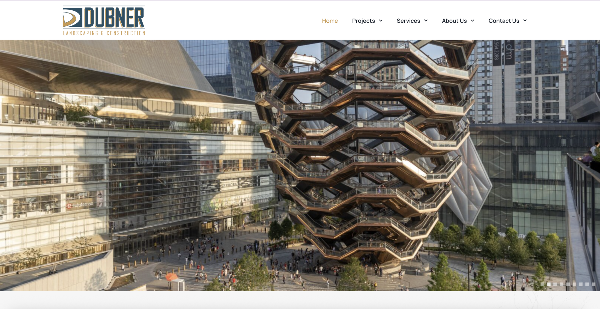
Dubner Companies
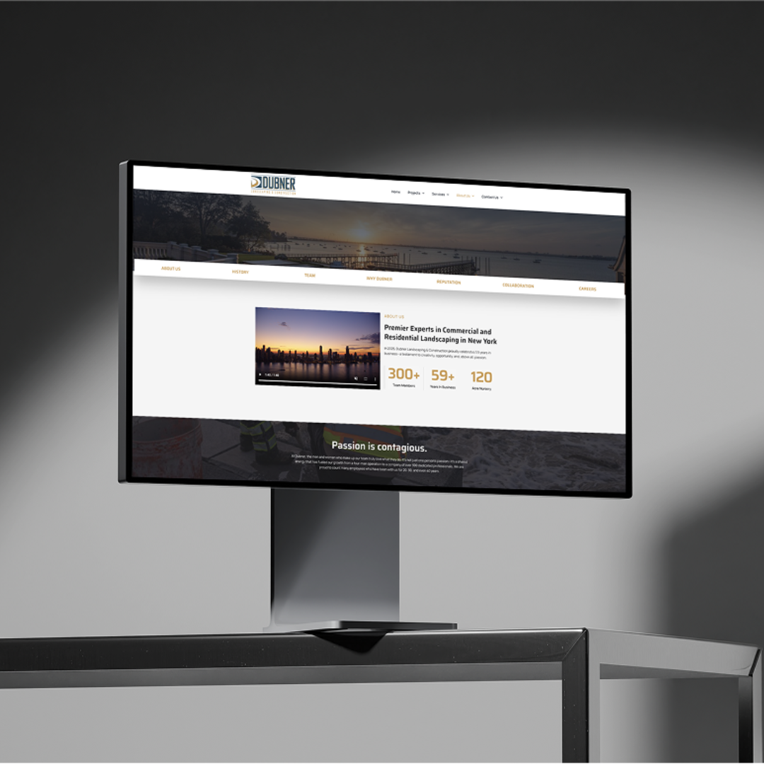
Dubner is one of the most established landscape construction companies in the country, with more than 60 years in business, more than 300 employees, and a portfolio that stretches from high-end residential estates to major public and commercial work across Manhattan, Long Island, and the Tri-State area. For Windwood, the website project mattered because it was not a small refresh. It was a large-scale build for a multi-division company with some of the most visible outdoor work in New York. The site needed to carry that weight and present Dubner with the level of clarity, scale, and polish the company had already earned.
.fe-69d265825a9a455f17cb2e0a {
–grid-gutter: calc(var(–sqs-mobile-site-gutter, 6vw) – 11.0px);
–cell-max-width: calc( ( var(–sqs-site-max-width, 1500px) – (11.0px * (8 – 1)) ) / 8 );
display: grid;
position: relative;
grid-area: 1/1/-1/-1;
grid-template-rows: repeat(22,minmax(24px, auto));
grid-template-columns:
minmax(var(–grid-gutter), 1fr)
repeat(8, minmax(0, var(–cell-max-width)))
minmax(var(–grid-gutter), 1fr);
row-gap: 11.0px;
column-gap: 11.0px;
overflow-x: hidden;
overflow-x: clip;
}
@media (min-width: 768px) {
.background-width–inset .fe-69d265825a9a455f17cb2e0a {
–inset-padding: calc(var(–sqs-site-gutter) * 2);
}
.fe-69d265825a9a455f17cb2e0a {
–grid-gutter: calc(var(–sqs-site-gutter, 4vw) – 11.0px);
–cell-max-width: calc( ( var(–sqs-site-max-width, 1500px) – (11.0px * (24 – 1)) ) / 24 );
–inset-padding: 0vw;
–row-height-scaling-factor: 0.0215;
–container-width: min(var(–sqs-site-max-width, 1500px), calc(100vw – var(–sqs-site-gutter, 4vw) * 2 – var(–inset-padding) ));
grid-template-rows: repeat(26,minmax(calc(var(–container-width) * var(–row-height-scaling-factor)), auto));
grid-template-columns:
minmax(var(–grid-gutter), 1fr)
repeat(24, minmax(0, var(–cell-max-width)))
minmax(var(–grid-gutter), 1fr);
}
}
.fe-block-9210a1d1e4ad7ad98c21 {
grid-area: 2/2/13/10;
z-index: 4;
@media (max-width: 767px) {
}
}
.fe-block-9210a1d1e4ad7ad98c21 .sqs-block {
justify-content: center;
}
.fe-block-9210a1d1e4ad7ad98c21 .sqs-block-alignment-wrapper {
align-items: center;
}
@media (min-width: 768px) {
.fe-block-9210a1d1e4ad7ad98c21 {
grid-area: 1/14/27/27;
z-index: 4;
}
.fe-block-9210a1d1e4ad7ad98c21 .sqs-block {
justify-content: center;
}
.fe-block-9210a1d1e4ad7ad98c21 .sqs-block-alignment-wrapper {
align-items: center;
}
}
.fe-block-ac528fd62df7da6f6963 {
grid-area: 13/2/15/10;
z-index: 5;
@media (max-width: 767px) {
}
}
.fe-block-ac528fd62df7da6f6963 .sqs-block {
justify-content: flex-start;
}
.fe-block-ac528fd62df7da6f6963 .sqs-block-alignment-wrapper {
align-items: flex-start;
}
@media (min-width: 768px) {
.fe-block-ac528fd62df7da6f6963 {
grid-area: 1/2/15/14;
z-index: 5;
}
.fe-block-ac528fd62df7da6f6963 .sqs-block {
justify-content: flex-start;
}
.fe-block-ac528fd62df7da6f6963 .sqs-block-alignment-wrapper {
align-items: flex-start;
}
}
.fe-block-yui_3_17_2_1_1775393282447_211619 {
grid-area: 15/2/21/10;
z-index: 8;
@media (max-width: 767px) {
}
}
.fe-block-yui_3_17_2_1_1775393282447_211619 .sqs-block {
justify-content: center;
}
.fe-block-yui_3_17_2_1_1775393282447_211619 .sqs-block-alignment-wrapper {
align-items: center;
}
@media (min-width: 768px) {
.fe-block-yui_3_17_2_1_1775393282447_211619 {
grid-area: 15/2/23/14;
z-index: 8;
}
.fe-block-yui_3_17_2_1_1775393282447_211619 .sqs-block {
justify-content: center;
}
.fe-block-yui_3_17_2_1_1775393282447_211619 .sqs-block-alignment-wrapper {
align-items: center;
}
}
.fe-block-yui_3_17_2_1_1775393282447_212167 {
grid-area: 21/2/23/10;
z-index: 9;
@media (max-width: 767px) {
}
}
.fe-block-yui_3_17_2_1_1775393282447_212167 .sqs-block {
justify-content: center;
}
.fe-block-yui_3_17_2_1_1775393282447_212167 .sqs-block-alignment-wrapper {
align-items: center;
}
@media (min-width: 768px) {
.fe-block-yui_3_17_2_1_1775393282447_212167 {
grid-area: 23/2/27/14;
z-index: 9;
}
.fe-block-yui_3_17_2_1_1775393282447_212167 .sqs-block {
justify-content: center;
}
.fe-block-yui_3_17_2_1_1775393282447_212167 .sqs-block-alignment-wrapper {
align-items: center;
}
}
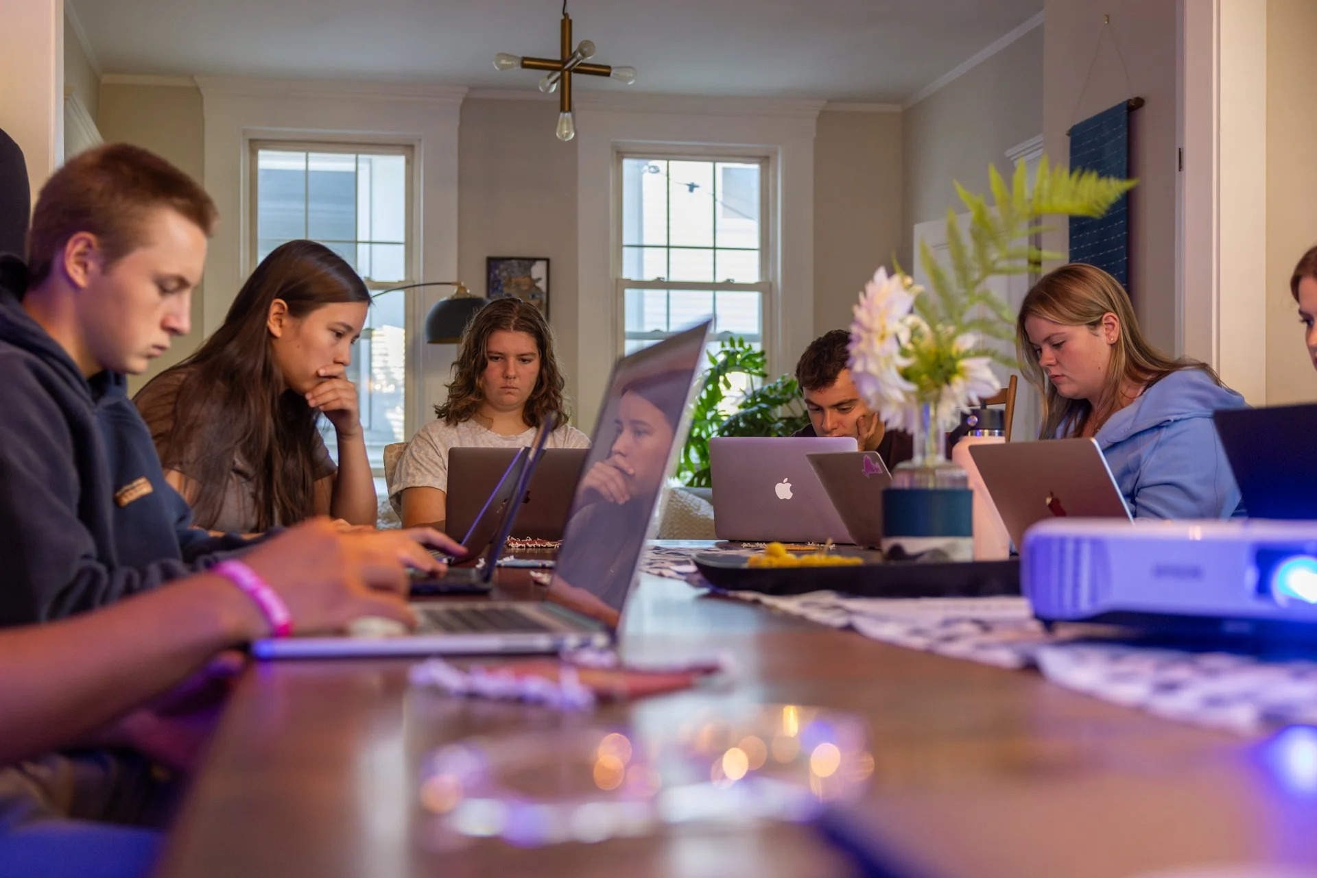
Forbes College Consulting
For Forbes College Consulting, trust and expertise are key differentiators. We built the website from the content outward, starting with original photo and video assets, including header media, to help shape a more personal and credible online presence.
With more than 26 years of experience helping students and families navigate college admissions, the Forbes needed a site that felt clear, supportive, and specific to the experience it offers. Creating the media first gave the rest of the build a stronger narrative and a more polished visual foundation.

.fe-69d266a457c1da236fefd209 {
–grid-gutter: calc(var(–sqs-mobile-site-gutter, 6vw) – 11.0px);
–cell-max-width: calc( ( var(–sqs-site-max-width, 1500px) – (11.0px * (8 – 1)) ) / 8 );
display: grid;
position: relative;
grid-area: 1/1/-1/-1;
grid-template-rows: repeat(22,minmax(24px, auto));
grid-template-columns:
minmax(var(–grid-gutter), 1fr)
repeat(8, minmax(0, var(–cell-max-width)))
minmax(var(–grid-gutter), 1fr);
row-gap: 11.0px;
column-gap: 11.0px;
overflow-x: hidden;
overflow-x: clip;
}
@media (min-width: 768px) {
.background-width–inset .fe-69d266a457c1da236fefd209 {
–inset-padding: calc(var(–sqs-site-gutter) * 2);
}
.fe-69d266a457c1da236fefd209 {
–grid-gutter: calc(var(–sqs-site-gutter, 4vw) – 11.0px);
–cell-max-width: calc( ( var(–sqs-site-max-width, 1500px) – (11.0px * (24 – 1)) ) / 24 );
–inset-padding: 0vw;
–row-height-scaling-factor: 0.0215;
–container-width: min(var(–sqs-site-max-width, 1500px), calc(100vw – var(–sqs-site-gutter, 4vw) * 2 – var(–inset-padding) ));
grid-template-rows: repeat(28,minmax(calc(var(–container-width) * var(–row-height-scaling-factor)), auto));
grid-template-columns:
minmax(var(–grid-gutter), 1fr)
repeat(24, minmax(0, var(–cell-max-width)))
minmax(var(–grid-gutter), 1fr);
}
}
.fe-block-d1132a964262ff1dad4f {
grid-area: 2/2/13/10;
z-index: 4;
@media (max-width: 767px) {
}
}
.fe-block-d1132a964262ff1dad4f .sqs-block {
justify-content: center;
}
.fe-block-d1132a964262ff1dad4f .sqs-block-alignment-wrapper {
align-items: center;
}
@media (min-width: 768px) {
.fe-block-d1132a964262ff1dad4f {
grid-area: 2/1/29/14;
z-index: 4;
}
.fe-block-d1132a964262ff1dad4f .sqs-block {
justify-content: center;
}
.fe-block-d1132a964262ff1dad4f .sqs-block-alignment-wrapper {
align-items: center;
}
}
.fe-block-697f345d0b28bda727f6 {
grid-area: 13/2/15/10;
z-index: 5;
@media (max-width: 767px) {
}
}
.fe-block-697f345d0b28bda727f6 .sqs-block {
justify-content: flex-start;
}
.fe-block-697f345d0b28bda727f6 .sqs-block-alignment-wrapper {
align-items: flex-start;
}
@media (min-width: 768px) {
.fe-block-697f345d0b28bda727f6 {
grid-area: 2/14/15/26;
z-index: 5;
}
.fe-block-697f345d0b28bda727f6 .sqs-block {
justify-content: flex-start;
}
.fe-block-697f345d0b28bda727f6 .sqs-block-alignment-wrapper {
align-items: flex-start;
}
}
.fe-block-yui_3_17_2_1_1775396650781_6949 {
grid-area: 15/2/21/10;
z-index: 6;
@media (max-width: 767px) {
}
}
.fe-block-yui_3_17_2_1_1775396650781_6949 .sqs-block {
justify-content: center;
}
.fe-block-yui_3_17_2_1_1775396650781_6949 .sqs-block-alignment-wrapper {
align-items: center;
}
@media (min-width: 768px) {
.fe-block-yui_3_17_2_1_1775396650781_6949 {
grid-area: 15/14/25/26;
z-index: 6;
}
.fe-block-yui_3_17_2_1_1775396650781_6949 .sqs-block {
justify-content: center;
}
.fe-block-yui_3_17_2_1_1775396650781_6949 .sqs-block-alignment-wrapper {
align-items: center;
}
}
.fe-block-yui_3_17_2_1_1775396650781_7548 {
grid-area: 21/2/23/10;
z-index: 7;
@media (max-width: 767px) {
}
}
.fe-block-yui_3_17_2_1_1775396650781_7548 .sqs-block {
justify-content: center;
}
.fe-block-yui_3_17_2_1_1775396650781_7548 .sqs-block-alignment-wrapper {
align-items: center;
}
@media (min-width: 768px) {
.fe-block-yui_3_17_2_1_1775396650781_7548 {
grid-area: 25/14/29/26;
z-index: 7;
}
.fe-block-yui_3_17_2_1_1775396650781_7548 .sqs-block {
justify-content: center;
}
.fe-block-yui_3_17_2_1_1775396650781_7548 .sqs-block-alignment-wrapper {
align-items: center;
}
}
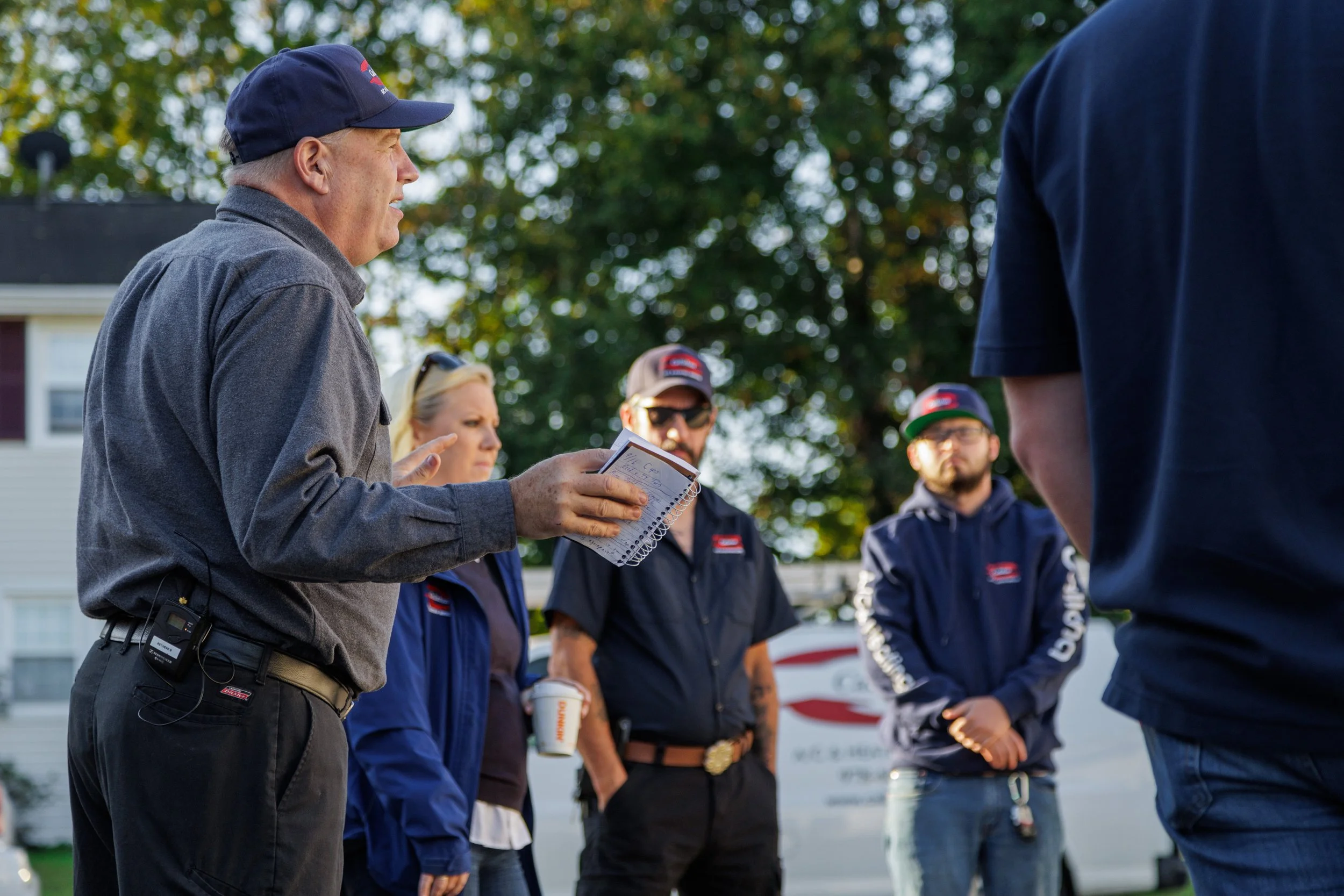
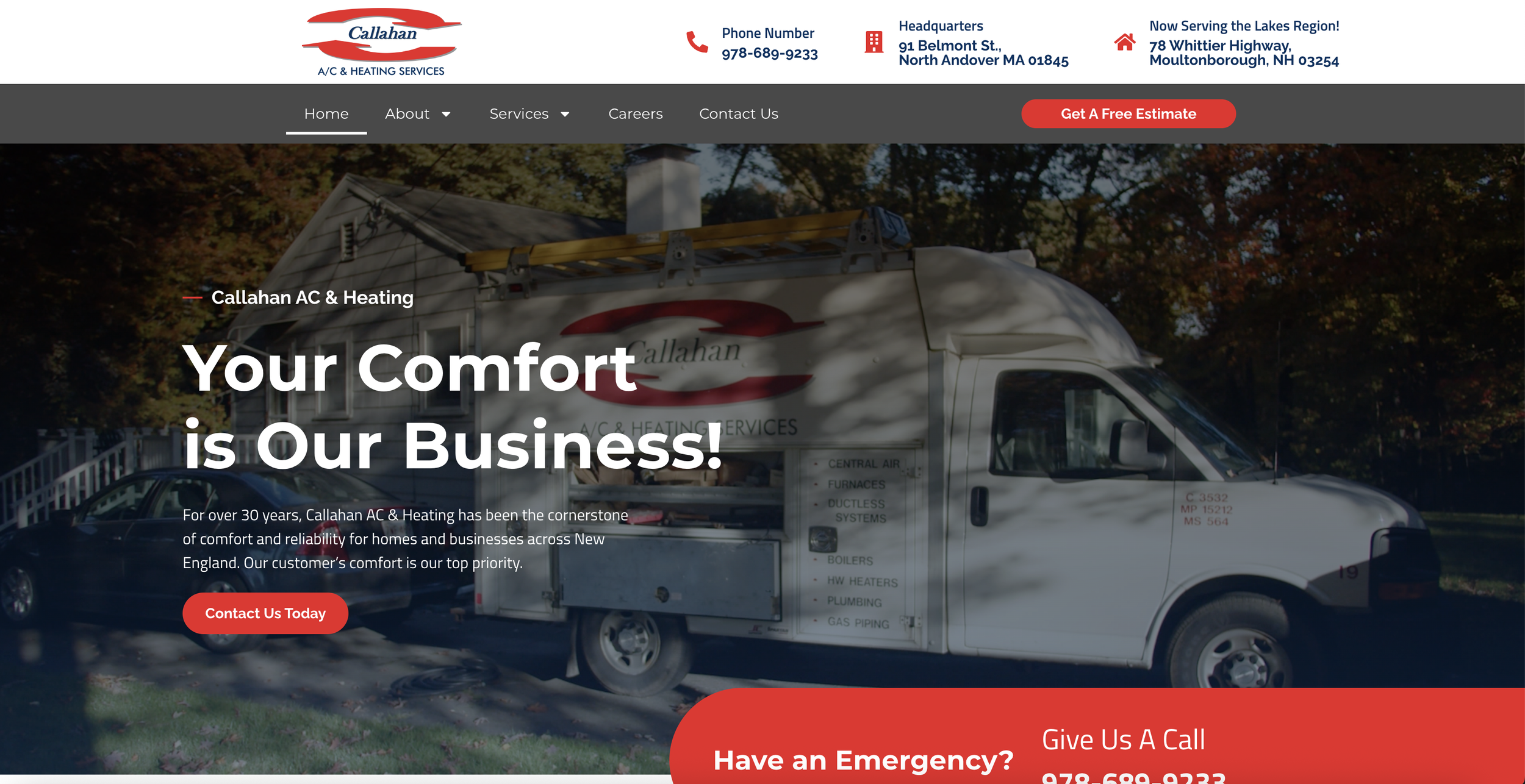
Callahan A/C & Heating
With more than 30 years serving homes and businesses across New England, Callahan needed a website that felt as established and trustworthy as the company itself.
We approached the project by building a bank of original photo and video content first, including header media and supporting visuals, then shaping the site around that material. That content-led approach gave the final build a much stronger foundation and helped the website reflect the scale, service range, and reputation behind the business.
.fe-69d25be6c2b9584c23c5ea5c {
–grid-gutter: calc(var(–sqs-mobile-site-gutter, 6vw) – 11.0px);
–cell-max-width: calc( ( var(–sqs-site-max-width, 1500px) – (11.0px * (8 – 1)) ) / 8 );
display: grid;
position: relative;
grid-area: 1/1/-1/-1;
grid-template-rows: repeat(11,minmax(24px, auto));
grid-template-columns:
minmax(var(–grid-gutter), 1fr)
repeat(8, minmax(0, var(–cell-max-width)))
minmax(var(–grid-gutter), 1fr);
row-gap: 11.0px;
column-gap: 11.0px;
overflow-x: hidden;
overflow-x: clip;
}
@media (min-width: 768px) {
.background-width–inset .fe-69d25be6c2b9584c23c5ea5c {
–inset-padding: calc(var(–sqs-site-gutter) * 2);
}
.fe-69d25be6c2b9584c23c5ea5c {
–grid-gutter: calc(var(–sqs-site-gutter, 4vw) – 11.0px);
–cell-max-width: calc( ( var(–sqs-site-max-width, 1500px) – (11.0px * (24 – 1)) ) / 24 );
–inset-padding: 0vw;
–row-height-scaling-factor: 0.0215;
–container-width: min(var(–sqs-site-max-width, 1500px), calc(100vw – var(–sqs-site-gutter, 4vw) * 2 – var(–inset-padding) ));
grid-template-rows: repeat(30,minmax(calc(var(–container-width) * var(–row-height-scaling-factor)), auto));
grid-template-columns:
minmax(var(–grid-gutter), 1fr)
repeat(24, minmax(0, var(–cell-max-width)))
minmax(var(–grid-gutter), 1fr);
}
}
.fe-block-yui_3_17_2_1_1775396650781_9316 {
grid-area: 1/2/3/10;
z-index: 1;
@media (max-width: 767px) {
}
}
.fe-block-yui_3_17_2_1_1775396650781_9316 .sqs-block {
justify-content: flex-start;
}
.fe-block-yui_3_17_2_1_1775396650781_9316 .sqs-block-alignment-wrapper {
align-items: flex-start;
}
@media (min-width: 768px) {
.fe-block-yui_3_17_2_1_1775396650781_9316 {
grid-area: 2/4/11/24;
z-index: 1;
}
.fe-block-yui_3_17_2_1_1775396650781_9316 .sqs-block {
justify-content: flex-start;
}
.fe-block-yui_3_17_2_1_1775396650781_9316 .sqs-block-alignment-wrapper {
align-items: flex-start;
}
}
.fe-block-yui_3_17_2_1_1775396650781_9743 {
grid-area: 3/2/5/10;
z-index: 2;
@media (max-width: 767px) {
}
}
.fe-block-yui_3_17_2_1_1775396650781_9743 .sqs-block {
justify-content: flex-start;
}
.fe-block-yui_3_17_2_1_1775396650781_9743 .sqs-block-alignment-wrapper {
align-items: flex-start;
}
@media (min-width: 768px) {
.fe-block-yui_3_17_2_1_1775396650781_9743 {
grid-area: 11/2/21/14;
z-index: 2;
}
.fe-block-yui_3_17_2_1_1775396650781_9743 .sqs-block {
justify-content: flex-start;
}
.fe-block-yui_3_17_2_1_1775396650781_9743 .sqs-block-alignment-wrapper {
align-items: flex-start;
}
}
.fe-block-fd53c6d8af38b03ff815 {
grid-area: 5/2/7/10;
z-index: 4;
@media (max-width: 767px) {
}
}
.fe-block-fd53c6d8af38b03ff815 .sqs-block {
justify-content: flex-start;
}
.fe-block-fd53c6d8af38b03ff815 .sqs-block-alignment-wrapper {
align-items: flex-start;
}
@media (min-width: 768px) {
.fe-block-fd53c6d8af38b03ff815 {
grid-area: 21/2/31/14;
z-index: 4;
}
.fe-block-fd53c6d8af38b03ff815 .sqs-block {
justify-content: flex-start;
}
.fe-block-fd53c6d8af38b03ff815 .sqs-block-alignment-wrapper {
align-items: flex-start;
}
}
.fe-block-7035fc61c631d2d81bf7 {
grid-area: 7/2/9/10;
z-index: 3;
@media (max-width: 767px) {
}
}
.fe-block-7035fc61c631d2d81bf7 .sqs-block {
justify-content: flex-start;
}
.fe-block-7035fc61c631d2d81bf7 .sqs-block-alignment-wrapper {
align-items: flex-start;
}
@media (min-width: 768px) {
.fe-block-7035fc61c631d2d81bf7 {
grid-area: 11/14/21/26;
z-index: 3;
}
.fe-block-7035fc61c631d2d81bf7 .sqs-block {
justify-content: flex-start;
}
.fe-block-7035fc61c631d2d81bf7 .sqs-block-alignment-wrapper {
align-items: flex-start;
}
}
.fe-block-f4a758cb6c9bacdcf33d {
grid-area: 9/2/11/10;
z-index: 5;
@media (max-width: 767px) {
}
}
.fe-block-f4a758cb6c9bacdcf33d .sqs-block {
justify-content: flex-start;
}
.fe-block-f4a758cb6c9bacdcf33d .sqs-block-alignment-wrapper {
align-items: flex-start;
}
@media (min-width: 768px) {
.fe-block-f4a758cb6c9bacdcf33d {
grid-area: 21/14/31/26;
z-index: 5;
}
.fe-block-f4a758cb6c9bacdcf33d .sqs-block {
justify-content: flex-start;
}
.fe-block-f4a758cb6c9bacdcf33d .sqs-block-alignment-wrapper {
align-items: flex-start;
}
}
What working together looks like
A strong website project usually starts before design.
We want to understand what the company is actually trying to communicate, who the audience is, what the current site is missing, and what the new site needs to do better. In some cases, the answer is mostly structure and copy. In others, it is original photography, video, project stories, team visibility, or a broader content system that gives the site more real material to work with.
From there, we build the site around the business rather than asking the business to squeeze itself into a layout.
1. Discovery and positioning
We start by learning how the company actually works, what it wants people to understand, what the strongest proof is, and where the site needs to do a better job of earning trust or driving the next step.
3. Design and development
Once the structure is right, we design and build the site to support the company’s goals. That includes page flow, visual consistency, mobile responsiveness, and making sure the site feels aligned with the quality of the business behind it.
2. Content and structure
This is where a lot of website projects refine. We work best when we can help shape the content, not just wait for it. That may mean original photography, video, interview-based copy extraction, page planning, and a clearer hierarchy for how the site should explain the business.
4. Launch and next steps
When the site goes live, it should feel like a real step forward, not just a new skin over the same problems. Depending on the project, that may also open the door to ongoing SEO, updates, additional media, or stronger service and use-case development over time.
.fe-69d269025a9c73683f0e10c0 {
–grid-gutter: calc(var(–sqs-mobile-site-gutter, 6vw) – 11.0px);
–cell-max-width: calc( ( var(–sqs-site-max-width, 1500px) – (11.0px * (8 – 1)) ) / 8 );
display: grid;
position: relative;
grid-area: 1/1/-1/-1;
grid-template-rows: repeat(10,minmax(24px, auto));
grid-template-columns:
minmax(var(–grid-gutter), 1fr)
repeat(8, minmax(0, var(–cell-max-width)))
minmax(var(–grid-gutter), 1fr);
row-gap: 11.0px;
column-gap: 11.0px;
overflow-x: hidden;
overflow-x: clip;
}
@media (min-width: 768px) {
.background-width–inset .fe-69d269025a9c73683f0e10c0 {
–inset-padding: calc(var(–sqs-site-gutter) * 2);
}
.fe-69d269025a9c73683f0e10c0 {
–grid-gutter: calc(var(–sqs-site-gutter, 4vw) – 11.0px);
–cell-max-width: calc( ( var(–sqs-site-max-width, 1500px) – (11.0px * (24 – 1)) ) / 24 );
–inset-padding: 0vw;
–row-height-scaling-factor: 0.0215;
–container-width: min(var(–sqs-site-max-width, 1500px), calc(100vw – var(–sqs-site-gutter, 4vw) * 2 – var(–inset-padding) ));
grid-template-rows: repeat(16,minmax(calc(var(–container-width) * var(–row-height-scaling-factor)), auto));
grid-template-columns:
minmax(var(–grid-gutter), 1fr)
repeat(24, minmax(0, var(–cell-max-width)))
minmax(var(–grid-gutter), 1fr);
}
}
.fe-block-yui_3_17_2_1_1775396650781_31052 {
grid-area: 1/2/3/10;
z-index: 1;
@media (max-width: 767px) {
}
}
.fe-block-yui_3_17_2_1_1775396650781_31052 .sqs-block {
justify-content: flex-start;
}
.fe-block-yui_3_17_2_1_1775396650781_31052 .sqs-block-alignment-wrapper {
align-items: flex-start;
}
@media (min-width: 768px) {
.fe-block-yui_3_17_2_1_1775396650781_31052 {
grid-area: 1/2/17/14;
z-index: 1;
}
.fe-block-yui_3_17_2_1_1775396650781_31052 .sqs-block {
justify-content: flex-start;
}
.fe-block-yui_3_17_2_1_1775396650781_31052 .sqs-block-alignment-wrapper {
align-items: flex-start;
}
}
.fe-block-yui_3_17_2_1_1775396650781_31515 {
grid-area: 3/2/9/10;
z-index: 2;
@media (max-width: 767px) {
}
}
.fe-block-yui_3_17_2_1_1775396650781_31515 .sqs-block {
justify-content: center;
}
.fe-block-yui_3_17_2_1_1775396650781_31515 .sqs-block-alignment-wrapper {
align-items: center;
}
@media (min-width: 768px) {
.fe-block-yui_3_17_2_1_1775396650781_31515 {
grid-area: 3/14/11/26;
z-index: 2;
}
.fe-block-yui_3_17_2_1_1775396650781_31515 .sqs-block {
justify-content: center;
}
.fe-block-yui_3_17_2_1_1775396650781_31515 .sqs-block-alignment-wrapper {
align-items: center;
}
}
.fe-block-yui_3_17_2_1_1775396650781_32115 {
grid-area: 9/2/11/10;
z-index: 3;
@media (max-width: 767px) {
}
}
.fe-block-yui_3_17_2_1_1775396650781_32115 .sqs-block {
justify-content: center;
}
.fe-block-yui_3_17_2_1_1775396650781_32115 .sqs-block-alignment-wrapper {
align-items: center;
}
@media (min-width: 768px) {
.fe-block-yui_3_17_2_1_1775396650781_32115 {
grid-area: 11/14/14/26;
z-index: 3;
}
.fe-block-yui_3_17_2_1_1775396650781_32115 .sqs-block {
justify-content: center;
}
.fe-block-yui_3_17_2_1_1775396650781_32115 .sqs-block-alignment-wrapper {
align-items: center;
}
}
Common deliverables
A Windwood website project may include:
-
website strategy and page planning
-
site architecture
-
copywriting or content extraction
-
original photography
-
original video and header media
-
service page development
-
use case or project page development
-
team and leadership visibility
-
mobile-first web design
-
development and launch support
Not every project needs all of those. The point is to build the right site for the business, not to sell the largest possible package.
.fe-69d26bcb0f05f5653cebf8fa {
–grid-gutter: calc(var(–sqs-mobile-site-gutter, 6vw) – 11.0px);
–cell-max-width: calc( ( var(–sqs-site-max-width, 1500px) – (11.0px * (8 – 1)) ) / 8 );
display: grid;
position: relative;
grid-area: 1/1/-1/-1;
grid-template-rows: repeat(33,minmax(24px, auto));
grid-template-columns:
minmax(var(–grid-gutter), 1fr)
repeat(8, minmax(0, var(–cell-max-width)))
minmax(var(–grid-gutter), 1fr);
row-gap: 11.0px;
column-gap: 11.0px;
overflow-x: hidden;
overflow-x: clip;
}
@media (min-width: 768px) {
.background-width–inset .fe-69d26bcb0f05f5653cebf8fa {
–inset-padding: calc(var(–sqs-site-gutter) * 2);
}
.fe-69d26bcb0f05f5653cebf8fa {
–grid-gutter: calc(var(–sqs-site-gutter, 4vw) – 11.0px);
–cell-max-width: calc( ( var(–sqs-site-max-width, 1500px) – (11.0px * (24 – 1)) ) / 24 );
–inset-padding: 0vw;
–row-height-scaling-factor: 0.0215;
–container-width: min(var(–sqs-site-max-width, 1500px), calc(100vw – var(–sqs-site-gutter, 4vw) * 2 – var(–inset-padding) ));
grid-template-rows: repeat(20,minmax(calc(var(–container-width) * var(–row-height-scaling-factor)), auto));
grid-template-columns:
minmax(var(–grid-gutter), 1fr)
repeat(24, minmax(0, var(–cell-max-width)))
minmax(var(–grid-gutter), 1fr);
}
}
.fe-block-85d6186a562f2c7d06f5 {
grid-area: 1/2/3/10;
z-index: 1;
@media (max-width: 767px) {
}
}
.fe-block-85d6186a562f2c7d06f5 .sqs-block {
justify-content: flex-start;
}
.fe-block-85d6186a562f2c7d06f5 .sqs-block-alignment-wrapper {
align-items: flex-start;
}
@media (min-width: 768px) {
.fe-block-85d6186a562f2c7d06f5 {
grid-area: 1/6/3/22;
z-index: 2;
}
.fe-block-85d6186a562f2c7d06f5 .sqs-block {
justify-content: flex-start;
}
.fe-block-85d6186a562f2c7d06f5 .sqs-block-alignment-wrapper {
align-items: flex-start;
}
}
.fe-block-8ae8d1dba3abff6c144a {
grid-area: 3/3/5/9;
z-index: 3;
@media (max-width: 767px) {
}
}
.fe-block-8ae8d1dba3abff6c144a .sqs-block {
justify-content: flex-start;
}
.fe-block-8ae8d1dba3abff6c144a .sqs-block-alignment-wrapper {
align-items: flex-start;
}
@media (min-width: 768px) {
.fe-block-8ae8d1dba3abff6c144a {
grid-area: 4/4/7/13;
z-index: 4;
}
.fe-block-8ae8d1dba3abff6c144a .sqs-block {
justify-content: flex-start;
}
.fe-block-8ae8d1dba3abff6c144a .sqs-block-alignment-wrapper {
align-items: flex-start;
}
}
.fe-block-699b751fc1bfb40328f9 {
grid-area: 3/2/5/3;
z-index: 2;
@media (max-width: 767px) {
}
}
.fe-block-699b751fc1bfb40328f9 .sqs-block {
justify-content: flex-start;
}
.fe-block-699b751fc1bfb40328f9 .sqs-block-alignment-wrapper {
align-items: flex-start;
}
@media (min-width: 768px) {
.fe-block-699b751fc1bfb40328f9 {
grid-area: 4/2/6/3;
z-index: 3;
}
.fe-block-699b751fc1bfb40328f9 .sqs-block {
justify-content: flex-start;
}
.fe-block-699b751fc1bfb40328f9 .sqs-block-alignment-wrapper {
align-items: flex-start;
}
}
.fe-block-487ccee0fe9fd057113c {
grid-area: 5/3/10/9;
z-index: 4;
@media (max-width: 767px) {
}
}
.fe-block-487ccee0fe9fd057113c .sqs-block {
justify-content: flex-start;
}
.fe-block-487ccee0fe9fd057113c .sqs-block-alignment-wrapper {
align-items: flex-start;
}
@media (min-width: 768px) {
.fe-block-487ccee0fe9fd057113c {
grid-area: 4/14/6/26;
z-index: 5;
}
.fe-block-487ccee0fe9fd057113c .sqs-block {
justify-content: flex-start;
}
.fe-block-487ccee0fe9fd057113c .sqs-block-alignment-wrapper {
align-items: flex-start;
}
}
.fe-block-221bfa5f997a68fb87d0 {
grid-area: 10/2/11/10;
z-index: 8;
@media (max-width: 767px) {
}
}
.fe-block-221bfa5f997a68fb87d0 .sqs-block {
justify-content: center;
}
.fe-block-221bfa5f997a68fb87d0 .sqs-block-alignment-wrapper {
align-items: center;
}
@media (min-width: 768px) {
.fe-block-221bfa5f997a68fb87d0 {
grid-area: 7/2/8/26;
z-index: 9;
}
.fe-block-221bfa5f997a68fb87d0 .sqs-block {
justify-content: center;
}
.fe-block-221bfa5f997a68fb87d0 .sqs-block-alignment-wrapper {
align-items: center;
}
}
.fe-block-9b5bcd3d226bfc387f97 {
grid-area: 11/3/13/9;
z-index: 4;
@media (max-width: 767px) {
}
}
.fe-block-9b5bcd3d226bfc387f97 .sqs-block {
justify-content: flex-start;
}
.fe-block-9b5bcd3d226bfc387f97 .sqs-block-alignment-wrapper {
align-items: flex-start;
}
@media (min-width: 768px) {
.fe-block-9b5bcd3d226bfc387f97 {
grid-area: 8/4/12/14;
z-index: 5;
}
.fe-block-9b5bcd3d226bfc387f97 .sqs-block {
justify-content: flex-start;
}
.fe-block-9b5bcd3d226bfc387f97 .sqs-block-alignment-wrapper {
align-items: flex-start;
}
}
.fe-block-2fc7d88c5bf4fe75ab3f {
grid-area: 11/2/13/3;
z-index: 3;
@media (max-width: 767px) {
}
}
.fe-block-2fc7d88c5bf4fe75ab3f .sqs-block {
justify-content: flex-start;
}
.fe-block-2fc7d88c5bf4fe75ab3f .sqs-block-alignment-wrapper {
align-items: flex-start;
}
@media (min-width: 768px) {
.fe-block-2fc7d88c5bf4fe75ab3f {
grid-area: 8/2/10/3;
z-index: 4;
}
.fe-block-2fc7d88c5bf4fe75ab3f .sqs-block {
justify-content: flex-start;
}
.fe-block-2fc7d88c5bf4fe75ab3f .sqs-block-alignment-wrapper {
align-items: flex-start;
}
}
.fe-block-815393898ce4e4269782 {
grid-area: 13/3/17/9;
z-index: 5;
@media (max-width: 767px) {
}
}
.fe-block-815393898ce4e4269782 .sqs-block {
justify-content: flex-start;
}
.fe-block-815393898ce4e4269782 .sqs-block-alignment-wrapper {
align-items: flex-start;
}
@media (min-width: 768px) {
.fe-block-815393898ce4e4269782 {
grid-area: 8/14/11/26;
z-index: 6;
}
.fe-block-815393898ce4e4269782 .sqs-block {
justify-content: flex-start;
}
.fe-block-815393898ce4e4269782 .sqs-block-alignment-wrapper {
align-items: flex-start;
}
}
.fe-block-fa9b4d5f10ad187aa643 {
grid-area: 18/2/19/10;
z-index: 9;
@media (max-width: 767px) {
}
}
.fe-block-fa9b4d5f10ad187aa643 .sqs-block {
justify-content: center;
}
.fe-block-fa9b4d5f10ad187aa643 .sqs-block-alignment-wrapper {
align-items: center;
}
@media (min-width: 768px) {
.fe-block-fa9b4d5f10ad187aa643 {
grid-area: 13/2/14/26;
z-index: 10;
}
.fe-block-fa9b4d5f10ad187aa643 .sqs-block {
justify-content: center;
}
.fe-block-fa9b4d5f10ad187aa643 .sqs-block-alignment-wrapper {
align-items: center;
}
}
.fe-block-2fa17f2199850b68b9bd {
grid-area: 19/3/21/9;
z-index: 5;
@media (max-width: 767px) {
}
}
.fe-block-2fa17f2199850b68b9bd .sqs-block {
justify-content: flex-start;
}
.fe-block-2fa17f2199850b68b9bd .sqs-block-alignment-wrapper {
align-items: flex-start;
}
@media (min-width: 768px) {
.fe-block-2fa17f2199850b68b9bd {
grid-area: 14/4/18/14;
z-index: 6;
}
.fe-block-2fa17f2199850b68b9bd .sqs-block {
justify-content: flex-start;
}
.fe-block-2fa17f2199850b68b9bd .sqs-block-alignment-wrapper {
align-items: flex-start;
}
}
.fe-block-a0a30536df863515a1ef {
grid-area: 19/2/21/3;
z-index: 4;
@media (max-width: 767px) {
}
}
.fe-block-a0a30536df863515a1ef .sqs-block {
justify-content: flex-start;
}
.fe-block-a0a30536df863515a1ef .sqs-block-alignment-wrapper {
align-items: flex-start;
}
@media (min-width: 768px) {
.fe-block-a0a30536df863515a1ef {
grid-area: 14/2/16/3;
z-index: 5;
}
.fe-block-a0a30536df863515a1ef .sqs-block {
justify-content: flex-start;
}
.fe-block-a0a30536df863515a1ef .sqs-block-alignment-wrapper {
align-items: flex-start;
}
}
.fe-block-fcd6e3939053a6f413e5 {
grid-area: 21/3/25/9;
z-index: 6;
@media (max-width: 767px) {
}
}
.fe-block-fcd6e3939053a6f413e5 .sqs-block {
justify-content: flex-start;
}
.fe-block-fcd6e3939053a6f413e5 .sqs-block-alignment-wrapper {
align-items: flex-start;
}
@media (min-width: 768px) {
.fe-block-fcd6e3939053a6f413e5 {
grid-area: 14/14/16/26;
z-index: 7;
}
.fe-block-fcd6e3939053a6f413e5 .sqs-block {
justify-content: flex-start;
}
.fe-block-fcd6e3939053a6f413e5 .sqs-block-alignment-wrapper {
align-items: flex-start;
}
}
.fe-block-f23226716dafe6919caf {
grid-area: 26/2/27/10;
z-index: 10;
@media (max-width: 767px) {
}
}
.fe-block-f23226716dafe6919caf .sqs-block {
justify-content: center;
}
.fe-block-f23226716dafe6919caf .sqs-block-alignment-wrapper {
align-items: center;
}
@media (min-width: 768px) {
.fe-block-f23226716dafe6919caf {
grid-area: 18/2/19/26;
z-index: 11;
}
.fe-block-f23226716dafe6919caf .sqs-block {
justify-content: center;
}
.fe-block-f23226716dafe6919caf .sqs-block-alignment-wrapper {
align-items: center;
}
}
.fe-block-e9198663de0153a50c7b {
grid-area: 27/3/29/9;
z-index: 6;
@media (max-width: 767px) {
}
}
.fe-block-e9198663de0153a50c7b .sqs-block {
justify-content: flex-start;
}
.fe-block-e9198663de0153a50c7b .sqs-block-alignment-wrapper {
align-items: flex-start;
}
@media (min-width: 768px) {
.fe-block-e9198663de0153a50c7b {
grid-area: 19/4/21/14;
z-index: 7;
}
.fe-block-e9198663de0153a50c7b .sqs-block {
justify-content: flex-start;
}
.fe-block-e9198663de0153a50c7b .sqs-block-alignment-wrapper {
align-items: flex-start;
}
}
.fe-block-a57409c536d40a909709 {
grid-area: 27/2/29/3;
z-index: 5;
@media (max-width: 767px) {
}
}
.fe-block-a57409c536d40a909709 .sqs-block {
justify-content: flex-start;
}
.fe-block-a57409c536d40a909709 .sqs-block-alignment-wrapper {
align-items: flex-start;
}
@media (min-width: 768px) {
.fe-block-a57409c536d40a909709 {
grid-area: 19/2/21/3;
z-index: 6;
}
.fe-block-a57409c536d40a909709 .sqs-block {
justify-content: flex-start;
}
.fe-block-a57409c536d40a909709 .sqs-block-alignment-wrapper {
align-items: flex-start;
}
}
.fe-block-88195f1c0b863cb9aa64 {
grid-area: 29/3/32/9;
z-index: 7;
@media (max-width: 767px) {
}
}
.fe-block-88195f1c0b863cb9aa64 .sqs-block {
justify-content: flex-start;
}
.fe-block-88195f1c0b863cb9aa64 .sqs-block-alignment-wrapper {
align-items: flex-start;
}
@media (min-width: 768px) {
.fe-block-88195f1c0b863cb9aa64 {
grid-area: 19/14/20/26;
z-index: 8;
}
.fe-block-88195f1c0b863cb9aa64 .sqs-block {
justify-content: flex-start;
}
.fe-block-88195f1c0b863cb9aa64 .sqs-block-alignment-wrapper {
align-items: flex-start;
}
}
FAQs
Do you only build websites for trades companies?
1
No. A lot of our strongest web work has happened in those categories because the content-led approach gives those companies a real advantage, but the service itself is broader than that.
What makes Windwood a better fit than a typical web builder?
2
The biggest difference is that we are not relying on stock content and generic messaging to do the work. Our strongest websites are built around original media, stronger structure, and a clearer understanding of what the company actually needs to communicate.
Can you help with content if we do not have everything written?
3
Yes. In fact, that is often where the work gets better. Most clients are not best served by being handed a blank document and told to “send the copy.” We can help shape and pull the right information out of the business.
Do you only do large custom sites?
4
No. The right fit is less about size and more about whether the company wants a site that feels aligned with the quality of the business.
.fe-69d26c60c8c9604626a20f65 {
–grid-gutter: calc(var(–sqs-mobile-site-gutter, 6vw) – 11.0px);
–cell-max-width: calc( ( var(–sqs-site-max-width, 1500px) – (11.0px * (8 – 1)) ) / 8 );
display: grid;
position: relative;
grid-area: 1/1/-1/-1;
grid-template-rows: repeat(2,minmax(24px, auto));
grid-template-columns:
minmax(var(–grid-gutter), 1fr)
repeat(8, minmax(0, var(–cell-max-width)))
minmax(var(–grid-gutter), 1fr);
row-gap: 11.0px;
column-gap: 11.0px;
overflow-x: hidden;
overflow-x: clip;
}
@media (min-width: 768px) {
.background-width–inset .fe-69d26c60c8c9604626a20f65 {
–inset-padding: calc(var(–sqs-site-gutter) * 2);
}
.fe-69d26c60c8c9604626a20f65 {
–grid-gutter: calc(var(–sqs-site-gutter, 4vw) – 11.0px);
–cell-max-width: calc( ( var(–sqs-site-max-width, 1500px) – (11.0px * (24 – 1)) ) / 24 );
–inset-padding: 0vw;
–row-height-scaling-factor: 0.0215;
–container-width: min(var(–sqs-site-max-width, 1500px), calc(100vw – var(–sqs-site-gutter, 4vw) * 2 – var(–inset-padding) ));
grid-template-rows: repeat(9,minmax(calc(var(–container-width) * var(–row-height-scaling-factor)), auto));
grid-template-columns:
minmax(var(–grid-gutter), 1fr)
repeat(24, minmax(0, var(–cell-max-width)))
minmax(var(–grid-gutter), 1fr);
}
}
.fe-block-yui_3_17_2_1_1775396650781_41632 {
grid-area: 1/2/3/10;
z-index: 1;
@media (max-width: 767px) {
}
}
.fe-block-yui_3_17_2_1_1775396650781_41632 .sqs-block {
justify-content: flex-start;
}
.fe-block-yui_3_17_2_1_1775396650781_41632 .sqs-block-alignment-wrapper {
align-items: flex-start;
}
@media (min-width: 768px) {
.fe-block-yui_3_17_2_1_1775396650781_41632 {
grid-area: 1/6/10/22;
z-index: 1;
}
.fe-block-yui_3_17_2_1_1775396650781_41632 .sqs-block {
justify-content: flex-start;
}
.fe-block-yui_3_17_2_1_1775396650781_41632 .sqs-block-alignment-wrapper {
align-items: flex-start;
}
}
Why this work matters
For a lot of companies, the website is still the place where someone decides whether to take the business seriously.
That is why this work matters. A stronger site can help a company look more established, feel more trustworthy, explain itself more clearly, and convert the right visitors with a lot less friction. It can support sales, recruiting, brand visibility, and future marketing efforts all at once.
When this service is working the way it should, the website stops feeling like a side project and starts feeling like part of the company’s real operating presence.
.fe-69d26cf26d5a875c40dc3dad {
–grid-gutter: calc(var(–sqs-mobile-site-gutter, 6vw) – 11.0px);
–cell-max-width: calc( ( var(–sqs-site-max-width, 1500px) – (11.0px * (8 – 1)) ) / 8 );
display: grid;
position: relative;
grid-area: 1/1/-1/-1;
grid-template-rows: repeat(25,minmax(24px, auto));
grid-template-columns:
minmax(var(–grid-gutter), 1fr)
repeat(8, minmax(0, var(–cell-max-width)))
minmax(var(–grid-gutter), 1fr);
row-gap: 11.0px;
column-gap: 11.0px;
overflow-x: hidden;
overflow-x: clip;
}
@media (min-width: 768px) {
.background-width–inset .fe-69d26cf26d5a875c40dc3dad {
–inset-padding: calc(var(–sqs-site-gutter) * 2);
}
.fe-69d26cf26d5a875c40dc3dad {
–grid-gutter: calc(var(–sqs-site-gutter, 4vw) – 11.0px);
–cell-max-width: calc( ( var(–sqs-site-max-width, 1500px) – (11.0px * (24 – 1)) ) / 24 );
–inset-padding: 0vw;
–row-height-scaling-factor: 0.0215;
–container-width: min(var(–sqs-site-max-width, 1500px), calc(100vw – var(–sqs-site-gutter, 4vw) * 2 – var(–inset-padding) ));
grid-template-rows: repeat(20,minmax(calc(var(–container-width) * var(–row-height-scaling-factor)), auto));
grid-template-columns:
minmax(var(–grid-gutter), 1fr)
repeat(24, minmax(0, var(–cell-max-width)))
minmax(var(–grid-gutter), 1fr);
}
}
.fe-block-82bb73589d388a4d0496 {
grid-area: 1/2/3/10;
z-index: 1;
@media (max-width: 767px) {
}
}
.fe-block-82bb73589d388a4d0496 .sqs-block {
justify-content: flex-start;
}
.fe-block-82bb73589d388a4d0496 .sqs-block-alignment-wrapper {
align-items: flex-start;
}
@media (min-width: 768px) {
.fe-block-82bb73589d388a4d0496 {
grid-area: 1/2/4/11;
z-index: 1;
}
.fe-block-82bb73589d388a4d0496 .sqs-block {
justify-content: flex-start;
}
.fe-block-82bb73589d388a4d0496 .sqs-block-alignment-wrapper {
align-items: flex-start;
}
}
.fe-block-72862fd743737b5139d2 {
grid-area: 7/2/26/10;
z-index: 3;
@media (max-width: 767px) {
}
}
.fe-block-72862fd743737b5139d2 .sqs-block {
justify-content: flex-start;
}
.fe-block-72862fd743737b5139d2 .sqs-block-alignment-wrapper {
align-items: flex-start;
}
@media (min-width: 768px) {
.fe-block-72862fd743737b5139d2 {
grid-area: 1/14/21/26;
z-index: 3;
}
.fe-block-72862fd743737b5139d2 .sqs-block {
justify-content: flex-start;
}
.fe-block-72862fd743737b5139d2 .sqs-block-alignment-wrapper {
align-items: flex-start;
}
}
.fe-block-cb4fe92bfb5520d9d457 {
grid-area: 3/2/9/10;
z-index: 2;
@media (max-width: 767px) {
}
}
.fe-block-cb4fe92bfb5520d9d457 .sqs-block {
justify-content: flex-start;
}
.fe-block-cb4fe92bfb5520d9d457 .sqs-block-alignment-wrapper {
align-items: flex-start;
}
@media (min-width: 768px) {
.fe-block-cb4fe92bfb5520d9d457 {
grid-area: 3/2/12/10;
z-index: 2;
}
.fe-block-cb4fe92bfb5520d9d457 .sqs-block {
justify-content: flex-start;
}
.fe-block-cb4fe92bfb5520d9d457 .sqs-block-alignment-wrapper {
align-items: flex-start;
}
}
Get in Touch
If your website no longer reflects the quality of your business, or if you want to build something strong from the ground up, let’s talk.